Оглавление:
- 1 Простая HTML кнопка для сайта
- 2 Как сделать кнопку на CSS
- 3 Код обычной кнопки для сайта
- 4 Кнопка с градиентом
- 5 Красивые кнопки CSS
- 6 Стилизация кнопок с помощью CSS
- 7 Стиль кнопок с бликами
- 8 Кнопки меню
- 9 Объемная кнопка CSS
- 10 Вдавленная кнопка
- 11 Выпуклая кнопка HTML
- 12 Круглые CSS кнопки
- 13 Анимированная кнопка CSS
- 14 3D кнопка CSS
- 15 Оформление кнопок
Прошу заметить, что привести на этой странице кнопки в чистом стилевом виде очень сложно, влияют стили моего сайта, а вставлять их как картинки я не захотела. Поэтому лучше ориентироваться на код, который я прописываю для каждой кнопки и эксперементировать с ним на своей старанице.
Простая HTML кнопка для сайта
Есть несколько типов input для создания кнопки и тег button, атрибут этого тега type, может иметь значения button, reset или submit. Внешне и функционально они абсолютно одинаковы.
Вот их код:
Когда использовать тег button?
- button имеет открывающий и закрывающий тег, а значит он может содержать дочерние теги;
- когда текст на кнопке один, а значение value при клике должно передаваться другое;
Как сделать кнопку на CSS
Из ссылки, тега span или div можно сделать с помощью CSS очень даже симпатичную кнопку.
Вот ее код:
Посмотреть описание
В примерах для кнопок мы используем тег «a», а вот его атрибут
rel="nofollow"
тут совершенно не уместен, ибо почти всегда кнопки ведут на внутренние страницы сайта или запускают исполнение иных скриптов. Просто у меня это подставляет один плагин и я пока не могу его отключить.
Вот ее стиль:
a.knopka {
  color: #fff; /* цвет текста */
  text-decoration: none; /* убирать подчеркивание у ссылок */
  user-select: none; /* убирать выделение текста */
  background: rgb(212,75,56); /* фон кнопки */
  padding: .7em 1.5em; /* отступ от текста */
  outline: none; /* убирать контур в Mozilla */
}
a.knopka:hover {
  background: rgb(232,95,76); /* при наведении курсора мышки */
}
a.knopka:active {
  background: rgb(152,15,0); /* при нажатии */
}
А нужно ли изменять вид кнопки при наведении или делать кнопку с эффектом нажатия? Почему нет…
Динамические эффекты реализуются благодаря псевдоклассам:
- :hover — при наведении. С появлением сенсорных экранов необходимость в :hover отпала. Для остальных же нужно как минимум изменение вида курсора мышки, чтобы дать понять, что элемент не является декорацией;
- :active — в момент нажатия кнопки. Когда на странице тут же что-то явно происходит, например, переход по ссылке, загрузка модального окна, появляется значок обработки формы, то :active можно опустить;
- :focus — пока кнопка в фокусе, то есть когда пользователь нажал на кнопку, но еще не щелкнул курсором мышки в другое место окна браузера. Без :focus невозможно объединить visibility: hidden; и transition. Если слишком быстро убрать мышку, то элемент повиснет в «половинном» состоянии, например, ссылка будет прозрачна, но по ней можно делать переход
Надо признать, что сложнее всего придумать как будет вести себя кнопка во время нажатия.
Код обычной кнопки для сайта
Иногда самый простой внешний вид может выглядеть более стильно, чем навороченная с крутыми эффектами кнопка.
Вот ее код:
Добавить в корзину
Вот ее стиль:
a.button7 {
  font-weight: 700;
  color: white;
  text-decoration: none;
  padding: .8em 1em calc(.8em + 3px);
  border-radius: 3px;
  background: rgb(64,199,129);
  box-shadow: 0 -3px rgb(53,167,110) inset;
  transition: 0.2s;
}
a.button7:hover {
  background: rgb(53, 167, 110);
}
a.button7:active {
  background: rgb(33,147,90);
  box-shadow: 0 3px rgb(33,147,90) inset;
}
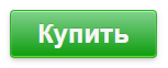
Кнопка с градиентом
Вот ее код:
Купить
Вот ее стиль:
a.button10 {
  display: inline-block;
  color: black;
  font-size: 125%;
  font-weight: 700;
  text-decoration: none;
  user-select: none;
  padding: .25em .5em;
  outline: none;
  border: 1px solid rgb(250,172,17);
  border-radius: 7px;
  background: rgb(255,212,3) linear-gradient(rgb(255,212,3), rgb(248,157,23));
  box-shadow: inset 0 -2px 1px rgba(0,0,0,0), inset 0 1px 2px rgba(0,0,0,0), inset 0 0 0 60px rgba(255,255,0,0);
  transition: box-shadow .2s, border-color .2s;
}
a.button10:hover {
  box-shadow: inset 0 -1px 1px rgba(0,0,0,0), inset 0 1px 2px rgba(0,0,0,0), inset 0 0 0 60px rgba(255,255,0,.5);
}
a.button10:active {
  padding: calc(.25em + 1px) .5em calc(.25em - 1px);
  border-color: rgba(177,159,0,1);
  box-shadow: inset 0 -1px 1px rgba(0,0,0,.1), inset 0 1px 2px rgba(0,0,0,.3), inset 0 0 0 60px rgba(255,255,0,.45);
}
Довольно популярно разделение кнопки на два цвета.
Вот ее код:
Положить в корзину
Вот ее стиль:
a.button25 {
  position: relative;
  display: inline-block;
  width: 15em;
  height: 2.5em;
  line-height: 2.5em;
  vertical-align: middle;
  text-align: center;
  text-decoration: none;
  text-shadow: 0 -1px 1px #777;
  color: #fff;
  outline: none;
  border: 2px solid #F64C2B;
  border-radius: 5px;
  box-shadow: 0 0 0 60px rgba(0,0,0,0) inset, .1em .1em .2em #800;
  background: linear-gradient(#FB9575, #F45A38 48%, #EA1502 52%, #F02F17);
}
a.button25:active {
  top: .1em;
  left: .1em;
  box-shadow: 0 0 0 60px rgba(0,0,0,.05) inset;
}
Красивые кнопки CSS
Извините, но с этого момента начнуться картинки, потому что стили уже слишком конфликтуют.
Вот код кнопки:
кнопка
Вот стиль кнопки:
/* дизайн подглядела у Эльдорадо и их картинку перевела в CSS */
a.button11 {
  position: relative;
  z-index: 1;
  color: black;
  font-size: 135%;
  font-weight: 700;
  text-decoration: none;
  padding: .25em .5em;
}
a.button11:after {
  content: "Купить";  /* здесь 6 букв */
  position: absolute;
  z-index: -1;
  top: -2px;
  bottom: -2px;
  left: -2px;
  width: calc(100% + 6*(1em*90/135) - 2px*2*2);  /* где 6*(1em*90/135), где 6 - это 6 букв, 90 - это font-size after, а 135 - это font-size родителя */
  text-align: right;
  color: #fff;
  font-size: 90%;
  padding: .25em .5em;
  border-radius: 5px;
  border: 2px solid #c61e40;
  -webkit-transform: skewX(-10deg);
  transform: skewX(-10deg);
  background: linear-gradient(#d4536d, #c61e40) no-repeat 100% 0;
  background-size: calc(6*(1em*90/135) + .5em) 100%;
  box-shadow: inset calc(-6*(1em*90/135) - .5em) 0 rgba(255,255,255,0);
  transition: .3s;
}
a.button11:hover:after {
  box-shadow: inset calc(-6*(1em*90/135) - .5em) 0 rgba(255,255,255,.2);
}
a.button11:active:after {
  background-image: linear-gradient(#c61e40, #d4536d);
}
Вот код кнопки:
кнопка
Вот стиль кнопки:
a.button15 {
  display: inline-block;
  font-family: arial,sans-serif;
  font-size: 11px;
  font-weight: bold;
  color: rgb(68,68,68);
  text-decoration: none;
  user-select: none;
  padding: .2em 1.2em;
  outline: none;
  border: 1px solid rgba(0,0,0,.1);
  border-radius: 2px;
  background: rgb(245,245,245) linear-gradient(#f4f4f4, #f1f1f1);
  transition: all .218s ease 0s;
}
a.button15:hover {
  color: rgb(24,24,24);
  border: 1px solid rgb(198,198,198);
  background: #f7f7f7 linear-gradient(#f7f7f7, #f1f1f1);
  box-shadow: 0 1px 2px rgba(0,0,0,.1);
}
a.button15:active {
  color: rgb(51,51,51);
  border: 1px solid rgb(204,204,204);
  background: rgb(238,238,238) linear-gradient(rgb(238,238,238), rgb(224,224,224));
  box-shadow: 0 1px 2px rgba(0,0,0,.1) inset;
}

Вот код кнопки:
кнопка
Вот стиль кнопки:
 /* стили подбирала "на глаз" */
a.button17 {
  display: inline-block;
  font-family: arial,sans-serif;
  font-size: 11px;
  color: rgb(205,216,228);
  text-shadow: 0 -1px rgb(46,53,58);
  text-decoration: none;
  user-select: none;
  line-height: 2em;
  padding: 1px 1.2em;
  outline: none;
  border: 1px solid rgba(33,43,52,1);
  border-radius: 3px;
  background: rgb(81,92,102) linear-gradient(rgb(81,92,102), rgb(69,78,87));
  box-shadow:
   inset 0 1px rgba(101,114,126,1),
   inset 0 0 1px rgba(140,150,170,.8),
   0 1px rgb(83,94,104),
   0 0 1px rgb(86,96,106);
}
a.button17:active {
  box-shadow:
   inset 0 1px 3px rgba(0,10,20,.5),
   0 1px rgb(83,94,104),
   0 0 1px rgb(86,96,106);
}
a.button17:focus:not(:active) {
  border: 1px solid rgb(22,32,43);
  border-bottom: 1px solid rgb(25,34,45);
  background: rgb(53,61,71);
  box-shadow:
   inset 0 1px 3px rgba(0,10,20,.5),
   0 1px rgb(83,94,104),
   0 0 1px rgb(86,96,106);
  pointer-events: none;
}
Стилизация кнопок с помощью CSS
Анимированная кнопка со свечением текста.
Вот код кнопки:
Вот стиль кнопки:
input.button4 {
  position: relative;
  display: inline-block;
  font-family: Arial,Helvetica,FreeSans,"Liberation Sans","Nimbus Sans L",sans-serif;
  font-size: 1.5em;
  font-weight: 700;
  color: rgb(245,245,245);
  text-shadow: 0 -1px rgba(0,0,0,.1);
  text-decoration: none;
  user-select: none;
  padding: .3em 1em;
  outline: none;
  border: none;
  border-radius: 3px;
  background: #0c9c0d linear-gradient(#82d18d, #0c9c0d);
  box-shadow: inset #72de26 0 -1px 1px, inset 0 1px 1px #98ff98, #3caa3c 0 0 0 1px, rgba(0,0,0,.3) 0 2px 5px;
  -webkit-animation: pulsate 1.2s linear infinite;
  animation: pulsate 1.2s linear infinite;
}
input.button4:hover {
  -webkit-animation-play-state: paused;
  animation-play-state: paused;
  cursor: pointer;
}
input.button4:active {
  top: 1px;
  color: #fff;
  text-shadow: 0 -1px rgba(0,0,0,.3), 0 0 5px #ffd, 0 0 8px #fff;
  box-shadow: 0 -1px 3px rgba(0,0,0,.3), 0 1px 1px #fff, inset 0 1px 2px rgba(0,0,0,.8), inset 0 -1px 0 rgba(0,0,0,.05);
}
@-webkit-keyframes pulsate {
  50% {color: #fff; text-shadow: 0 -1px rgba(0,0,0,.3), 0 0 5px #ffd, 0 0 8px #fff;}
}
@keyframes pulsate {
  50% {color: #fff; text-shadow: 0 -1px rgba(0,0,0,.3), 0 0 5px #ffd, 0 0 8px #fff;}
}
Стиль кнопок с бликами
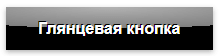
Вот код кнопки:
Глянцевая кнопка
Вот стиль кнопки:
a.button1 {
  position: relative;
  color: white;
  font-weight: bold;
  text-decoration: none;
  text-shadow: -1px -1px #000;
  user-select: none;
  padding: .8em 2em;
  outline: none;
  background-color: #000;
  background-image: linear-gradient(45deg, rgba(255,255,255,.0) 30%, rgba(255,255,255,.8), rgba(255,255,255,.0) 70%), radial-gradient(190% 100% at 50% 0%, rgba(255,255,255,.7) 0%, rgba(255,255,255,.5) 50%, rgba(0,0,0,0) 50%);
  background-repeat: no-repeat;
  background-size: 200% 100%, auto;
  background-position: 200% 0, 0 0;
  box-shadow: rgba(0,0,0,.3) 0 2px 5px;
}
a.button1:active {
  top: 1px;
  box-shadow: none;
}
a.button1:hover {
  transition: .5s linear;
  background-position: -200% 0, 0 0;
}
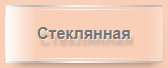
Вот код кнопки:
Стеклянная кнопка
Вот стиль кнопки:
a.button9 {
  position: relative;
  display: inline-block;
  color: #777674;
  font-weight: bold;
  text-decoration: none;
  text-shadow: rgba(255,255,255,.5) 1px 1px, rgba(100,100,100,.3) 3px 7px 3px;
  user-select: none;
  padding: 1em 2em;
  outline: none;
  border-radius: 3px / 100%;
  background-image:
   linear-gradient(45deg, rgba(255,255,255,.0) 30%, rgba(255,255,255,.8), rgba(255,255,255,.0) 70%),
   linear-gradient(to right, rgba(255,255,255,1), rgba(255,255,255,0) 20%, rgba(255,255,255,0) 90%, rgba(255,255,255,.3)),
   linear-gradient(to right, rgba(125,125,125,1), rgba(255,255,255,.9) 45%, rgba(125,125,125,.5)),
   linear-gradient(to right, rgba(125,125,125,1), rgba(255,255,255,.9) 45%, rgba(125,125,125,.5)),
   linear-gradient(to right, rgba(223,190,170,1), rgba(255,255,255,.9) 45%, rgba(223,190,170,.5)),
   linear-gradient(to right, rgba(223,190,170,1), rgba(255,255,255,.9) 45%, rgba(223,190,170,.5));
  background-repeat: no-repeat;
  background-size: 200% 100%, auto, 100% 2px, 100% 2px, 100% 1px, 100% 1px;
  background-position: 200% 0, 0 0, 0 0, 0 100%, 0 4px, 0 calc(100% - 4px);
  box-shadow: rgba(0,0,0,.5) 3px 10px 10px -10px;
}
a.button9:hover {
  transition: .5s linear;
  background-position: -200% 0, 0 0, 0 0, 0 100%, 0 4px, 0 calc(100% - 4px);
}
a.button9:active {
  top: 1px;
}
Кнопки меню

Вот код:
Кнопка меню
Вот стиль:
a.button16 {
  display: inline-block;
  text-decoration: none;
  padding: 1em;
  outline: none;
  border-radius: 1px;
}
a.button16:hover {
  background-image:
   radial-gradient(1px 45% at 0% 50%, rgba(0,0,0,.6), transparent),
   radial-gradient(1px 45% at 100% 50%, rgba(0,0,0,.6), transparent);
}
a.button16:active {
  background-image:
   radial-gradient(45% 45% at 50% 100%, rgba(255,255,255,.9), rgba(255,255,255,0)),
   linear-gradient(rgba(255,255,255,.4), rgba(255,255,255,.3));
  box-shadow:
   inset rgba(162,95,42,.4) 0 0 0 1px,
   inset rgba(255,255,255,.9) 0 0 1px 3px;
}
Объемная кнопка CSS
Вот код:
Объемная кнопка
Вот стиль:
a.button20 {
  position: relative;
  display: inline-block;
  font-weight: bold;
  color: #000;
  text-decoration: none;
  text-shadow: -2px 2px rgba(255,255,255,.3);
  line-height: 1.1;
  padding: .5em 3em .5em .6em;
  background: linear-gradient(#ecc92b, #fce25b);
  box-shadow:
   0 0 0 1px #fce25b inset,
   -1px 0px rgb(220,195,35), -1px 1px rgb(192,167,7),
   -2px 1px rgb(219,194,34), -2px 2px rgb(191,166,6),
   -3px 2px rgb(218,193,33), -3px 3px rgb(190,165,5),
   -4px 3px rgb(217,192,32), -4px 4px rgb(189,164,4),
   -5px 4px rgb(216,191,31), -5px 5px rgb(188,163,3),
   -6px 5px rgb(215,190,30), -6px 6px rgb(187,162,2),
   -7px 6px rgb(214,189,29), -7px 7px rgb(186,161,1),
   -8px 7px rgb(213,188,28), -8px 8px rgb(185,160,0),
   -7px 9px 1px rgba(0,0,0,.4),
   -5px 11px 1px rgba(0,0,0,.2),
   -1px 13px 4px rgba(0,0,0,.2),
   4px 16px 7px rgba(0,0,0,.3);
  transition: .4s;
}
a.button20:active {
  box-shadow: none;
  -webkit-transform: translate(-7px, 8px);
  transform: translate(-7px, 8px);
}
a.button20:after {
  content: "";
  position: absolute;
  top: calc(50% - .6em/2);
  right: .6em;
  -webkit-transform: rotate(-45deg);
  transform: rotate(-45deg);
  border: .37em solid;
  border-top: none;
  border-left: none;
  width: .6em;
  height: .6em;
  box-shadow: inset -2px 2px rgba(255,255,255,.3);
}
Вдавленная кнопка
Вот код:
Вдавленная кнопка
Вот стиль:
a.button22 {
  position: relative;
  display: inline-block;
  width: 6em;
  height: 2.5em;
  line-height: 2.4em;
  vertical-align: middle;
  text-align: center;
  text-decoration: none;
  user-select: none;
  color: #000;
  outline: none;
  border: 1px solid rgba(110,121,128,.8);
  border-top-color: rgba(0,0,0,.3);
  border-radius: 5px;
  background: rgb(206, 220, 231) linear-gradient(rgb(206,220,231), rgb(89,106,114));
  box-shadow:
   0 -1px rgba(10,21,28,.9) inset,
   0 1px rgba(255,255,255,.5) inset;
}
a.button22:hover {
  background: linear-gradient(#d2dfea, #71828c);
}
a.button22:active {
  line-height: 2.6em;
  background: linear-gradient(#bac6cf, #c5d3de 20%, #71828c);
  box-shadow: 0 -1px rgba(255,255,255,.4) inset;
}
a.button22:before {
  content: "";
  position: absolute;
  top: -10px; right: -10px; bottom: -10px; left: -10px;
  z-index: -1;
  border-radius: 8px;
  background: linear-gradient(rgba(200,200,200,.5), rgba(240,240,240,.5));
}
Выпуклая кнопка HTML
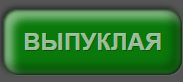
Код:
Выпуклая кнопка
Стиль:
a.boxShadow4 {
  display: inline-block;
  font-size: 24px;
  font-weight: bold;
  color: rgba(255,255,255,.6);
  text-shadow: 1px 1px rgba(0,0,0,.3);
  text-decoration: none;
  padding: 20px;
  border-radius: 15px;
  background: rgb(10,120,10);
  box-shadow:
   inset 0 0 3px 1px rgba(0,0,0,.8),
   inset rgba(0,0,0,.3) -5px -5px 8px 5px,
   inset rgba(255,255,255,.5) 5px 5px 8px 5px,
   1px 1px 1px rgba(255,255,255,.1),
   -2px -2px 5px rgba(0,0,0,.5);
  transition: .2s;
}
a.boxShadow4:hover {
  color: rgba(255,255,255,.9);
  background: rgb(20,130,20);
}
a.boxShadow4:active {
  background: rgb(0,110,0);
  box-shadow:
   inset 0 0 5px 3px rgba(0,0,0,.8),
   inset rgba(0,0,0,.3) -5px -5px 8px 5px,
   inset rgba(255,255,255,.5) 5px 5px 8px 5px,
   1px 1px 1px rgba(255,255,255,.2),
   -2px -2px 5px rgba(0,0,0,.5);
}
Круглые CSS кнопки

Код:
Стиль:
a.button29 {
  display: inline-block;
  width: 1.5em;
  height: 1.5em;
  vertical-align: middle;
  text-decoration: none;
  border: .5em solid rgba(0,0,0,0);
  border-radius: 100%;
  background: rgb(245,245,245) linear-gradient(rgb(245,245,245), rgb(188,192,193)) 50% 50% / calc(1.5em + .5em*2) calc(1.5em + .5em*2);
  box-shadow:
   inset 0 -3px 10px rgba(255,255,255,1),
   inset 0 3px 10px rgba(0,0,0,.4),
   0 2px 4px rgba(0,0,0,.9);
}

Код:
+
Стиль:
a.button30 {
  position: relative;
  z-index: 1;
  display: inline-block;
  width: 1.3em;
  height: 1.3em;
  line-height: 1.3em;
  vertical-align: middle;
  text-align: center;
  text-decoration: none;
  text-shadow: 1px 1px rgba(255,255,255,.3);
  font-size: 300%;
  font-weight: 900;
  color: #000;
  border-radius: 100%;
  background: rgb(144,142,105) linear-gradient(rgb(185,181,151), rgb(144,142,105));
  box-shadow:
   inset 0 -2px 1px rgba(0,0,0,.5),
   inset 0 2px 1px rgba(255,255,255,.9),
   0 4px 4px rgba(0,0,0,.9);
}
a.button30:after {
  content: "";
  position: absolute;
  z-index: -1;
  top: 12%;
  left: 12%;
  right: 12%;
  bottom: 12%;
  border-radius: 100%;
  background: rgb(242,203,20) linear-gradient(rgb(242,203,20), rgb(255,182,7));
  box-shadow:
   inset 0 2px 1px rgba(0,0,0,.5),
   inset 0 -2px 1px rgba(255,255,255,.3);
}
Анимированная кнопка CSS
Интересные эффекты анимации кнопки можно найти тут >>
3D кнопка CSS
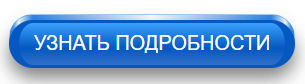
Код:
узнать подробности
Стиль:
a.button2, a.button2:before {
  display: inline-block;
  font-size: 20px;
  color: #fff;
  text-decoration: none;
  padding: 8px 15px;
  border-radius: 100px;
  border: solid rgb(4,88,192);
  border-width: 3px 10px;
  outline: none;
  opacity: 1;
  transition: .6s, opacity 0s 9999999s, visibility 0s 9999999s;
}
a.button2 {
  position: relative;
  padding: calc(8px + 3px - 1px) calc(15px + 10px - 1px);
  border: 1px solid rgba(62,153,239,.5);
  background: linear-gradient(to left, rgb(62,153,239) 1%, #fff 3%, rgb(44,135,232) 8%, rgba(255,255,255,.3) 50%, rgb(44,135,232) 92%, #fff 97%, rgb(62,153,239) 99%) no-repeat;
}
a.button2:before {
  content:  "УЗНАТЬ ПОДРОБНОСТИ";
  position:  absolute;
  bottom: -7px;
  left: -1px;
  width: calc(100% - (15px + 10px - 1px)*2);
  background: #fff linear-gradient(rgb(58,160,253), rgb(4,88,192) 60%, rgb(49,112,201));
  box-shadow: 0 10px 18px rgba(0,0,0,.5);
}
a.button2:hover {
  -webkit-transform: scale(1.1, 1.1);
  transform: scale(1.1, 1.1);
}
a.button2:hover:before {
  border-color: #0766d8;
  background: #fff linear-gradient(#3fadff, #0766d8 60%, #3279dd);
}
a.button2:focus,
a.button2:active {
  -webkit-transform: scale(2, 2);
  transform: scale(2, 2);
  opacity: 0;
  visibility: hidden;
  transition: .4s;
}
Оформление кнопок
Кнопки сайта следует выполнять в едином стиле, чтобы не оставалось сомнений, что если здесь нажать, то произойдет какое-то действо.
Кнопка с главным действием должна выделяться из общего содержания, быть контрастной. Тут главное не переусердствовать.
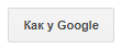
Именно поэтому у Google второстепенные кнопки сначала плоские, а после наведения мышки обретают объем. Это все приемы юзабилити, за которыми стоят эксперименты с аудиторией.
Также нужно победить желание сделать кнопку величиной со слона, чтобы не стать объектом баннерной слепоты.